
Which Way Now?

Make it stand out
After a series of visits to hospitals, railway stations and public buildings recently I’ve been really struck by the poor state of signage.

Call it a bit of a Busman’s Holiday if you like but when you are looking at and writing about the world as a designer the placement and logic of public signs is often confusing and misleading.
This tendency leads to impromptu non-standard signs spreading being photocopied, laminated, and sellotaped to walls, as reception staff get fed up with people having to ask for directions and attempt to add clarity for people.
And this happens even if the basic design of the signs themselves is frequently rather good.
Have a look at a few examples I’ve seen…
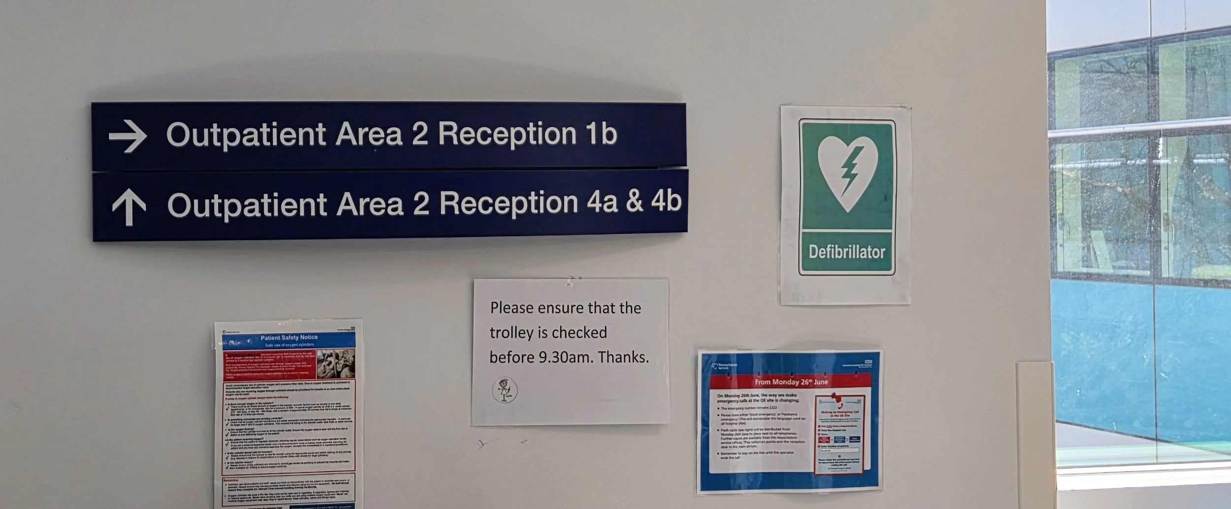
A recent trip to hospital for a check-up and I’m already confused by the signage.
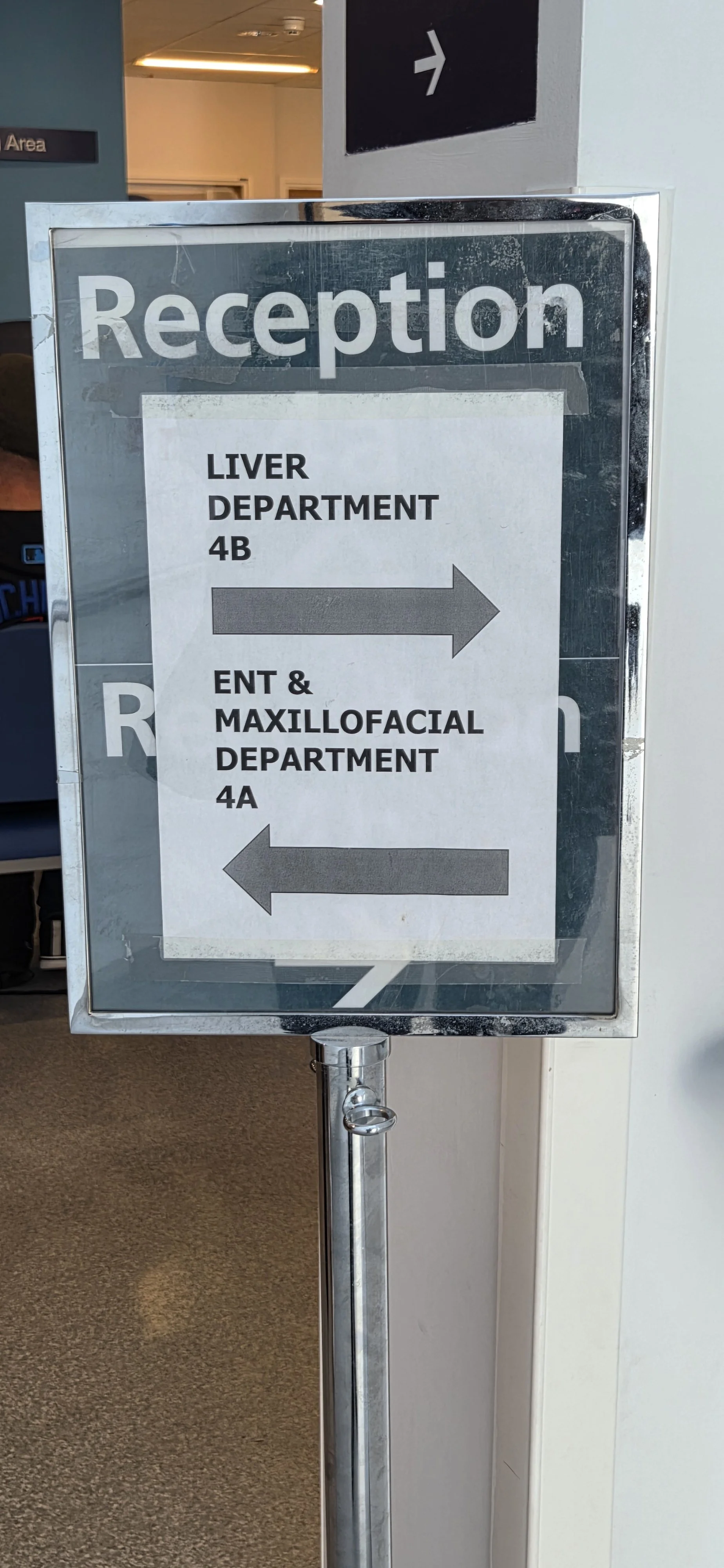
This is what awaits you at Reception
a temporary standing sign with another sign sellotaped to the front of it…
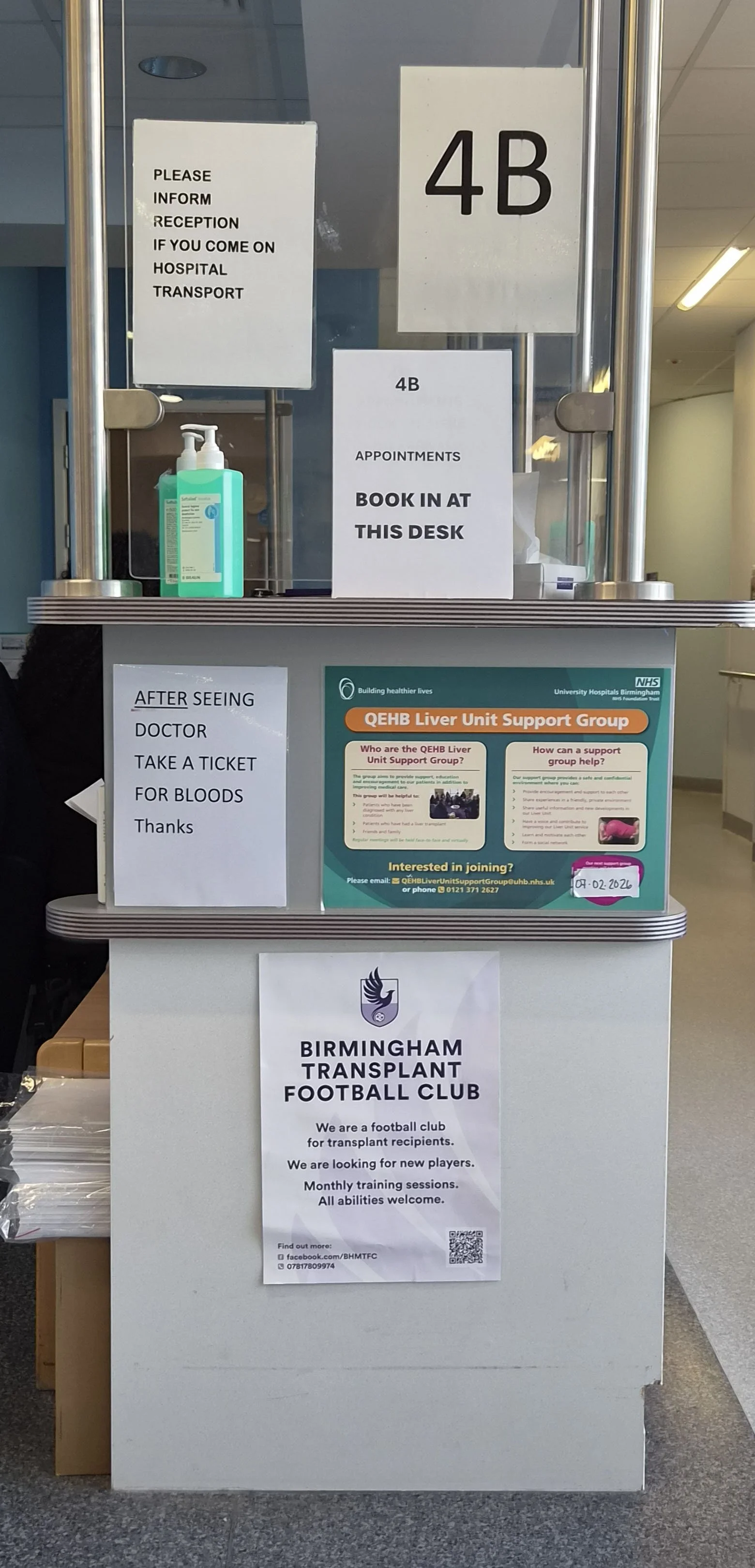
And this is what greet you
at Reception 4B.
Standards? Standards, who needs ‘em?
Ironically, many signs in these examples and across UK institutions are based on the standards established by Margaret Calvert and Jock Kinneir back in the 60s for British road signs, which have remained largely unchanged to this day.
These included the now-familiar red circles and triangles, using iconography such as ‘Men at Work’ or ‘Stop - Children’ and the creation of two fonts - Transport (for use on all road signage) and Motorway (a smaller character set for the larger route numbers used on motorway signs).


These standards found uses far beyond the UK, with variations in countries worldwide, and similar standards are used for organisations such as the UK Government website GOV.UK, the NHS, Transport for London, British Rail (formerly), British Airports Authority (also formerly) and the Tyne and Wear Metro (the last three also originally designed by Margaret Calvert).
Try another example from my hometown…
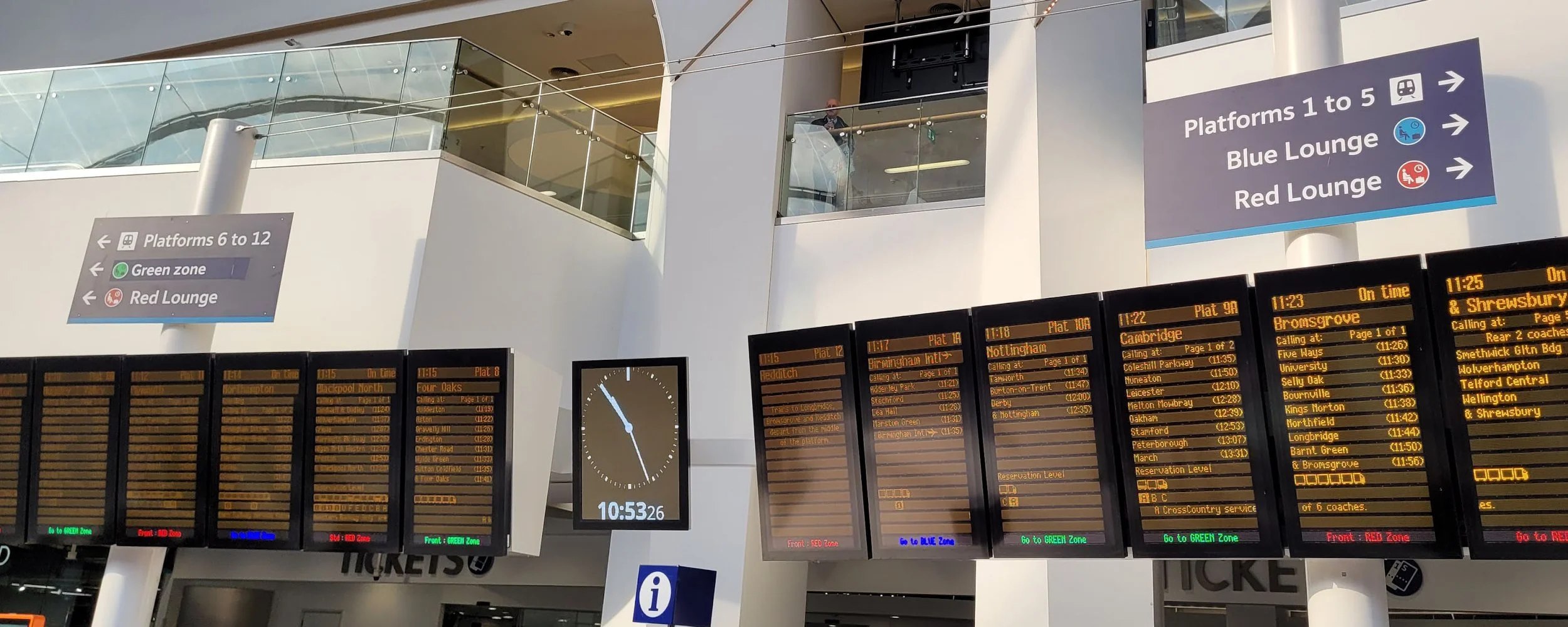
Birmingham New Street Station - go to the the Blue Lounge, either Red Lounge… or the Green Zone? Note that the display boards below refer to RED, BLUE and GREEN Zones.
So why is public building signage often so bad?
My reasoning is that the designers and architects of modern buildings plan the signs before they’ve had chance to physically walk around the structures - so, they don’t or can’t think of them as users would.
The standards themselves are fine, but they’re not applied sensibly or consistently, so you get a “Green Zone” next to a “Red Lounge” that aren’t signposted in green or red, all set in a space with numerous other signs and posters all vying for your attention.
Whilst I appreciate that these institutions are under a great deal of stress in the current economic climate, I do wonder how many patients arrive late for appointments or miss trains due to poor signage - and how much this ultimately costs, all for the sake of a bit of attention to detail?
Seen anything similar in your hometown?
Tell us all about it in the comments.